

Apollon.fi: a crypto wallet that finally feels like one you'd trust
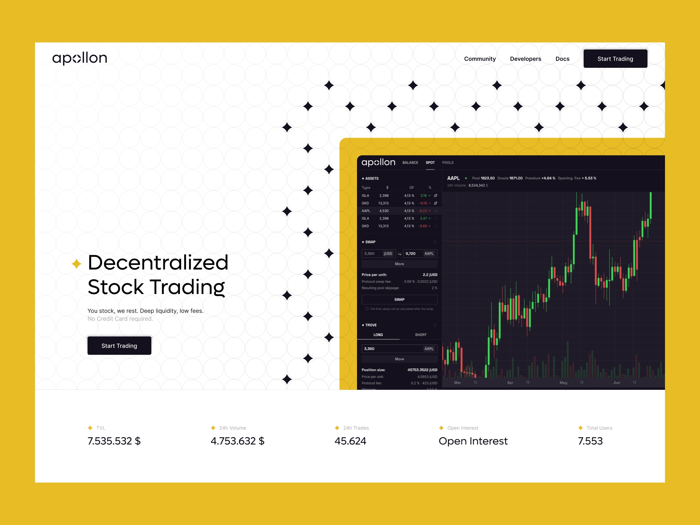
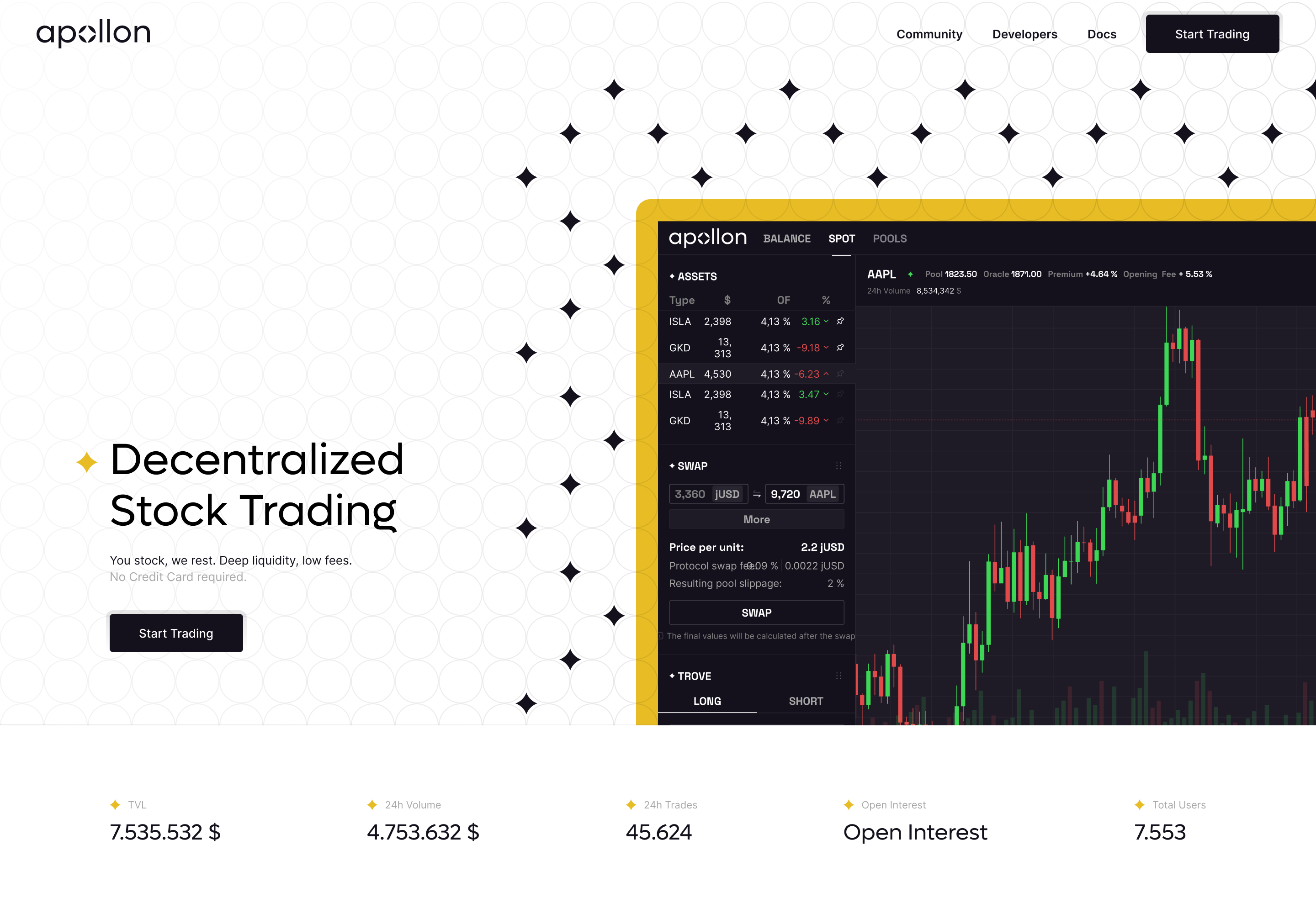
Apollon had a working wallet and a credible product. What it didn't have was a brand and a UI that matched. I rebuilt both: identity, scalable app design, and a Webflow site ready for the next phase of growth.
- Client
- Apollon.fi
- Industry
- Crypto wallet
- Role
- Branding, UX/UI, Webflow
The problem
Apollon.fi is a crypto wallet built to help users trade easily without third parties. The product was solid. The wrapping wasn't. Branding felt generic, the app lacked a cohesive UX, and there was no design system holding it all together. In a competitive market full of slick wallets, looking the part matters as much as working.
The goal
Build trust through brand. Make the app feel as fast and seamless as it actually is. Create a scalable system the team can extend without me. And ship a Webflow site that mirrors all of it, ready to grow into.
The process, phase by phase
Branding
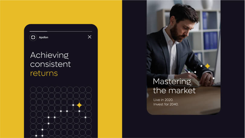
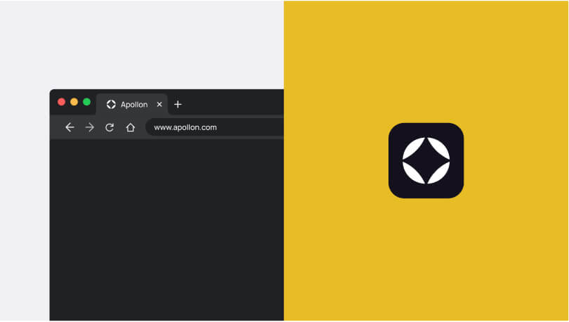
Worked with the client to shape the brand vision through moodboarding and concept exploration. Designed a typographic logo using the letter "O" as a spark of light, symbolising guidance and reliability. Built a palette of black, white, and deep purple-blue to signal trust, intelligence, and authority. Cooperated with Escalate Ltd creative studio on the broader strategy.
App design
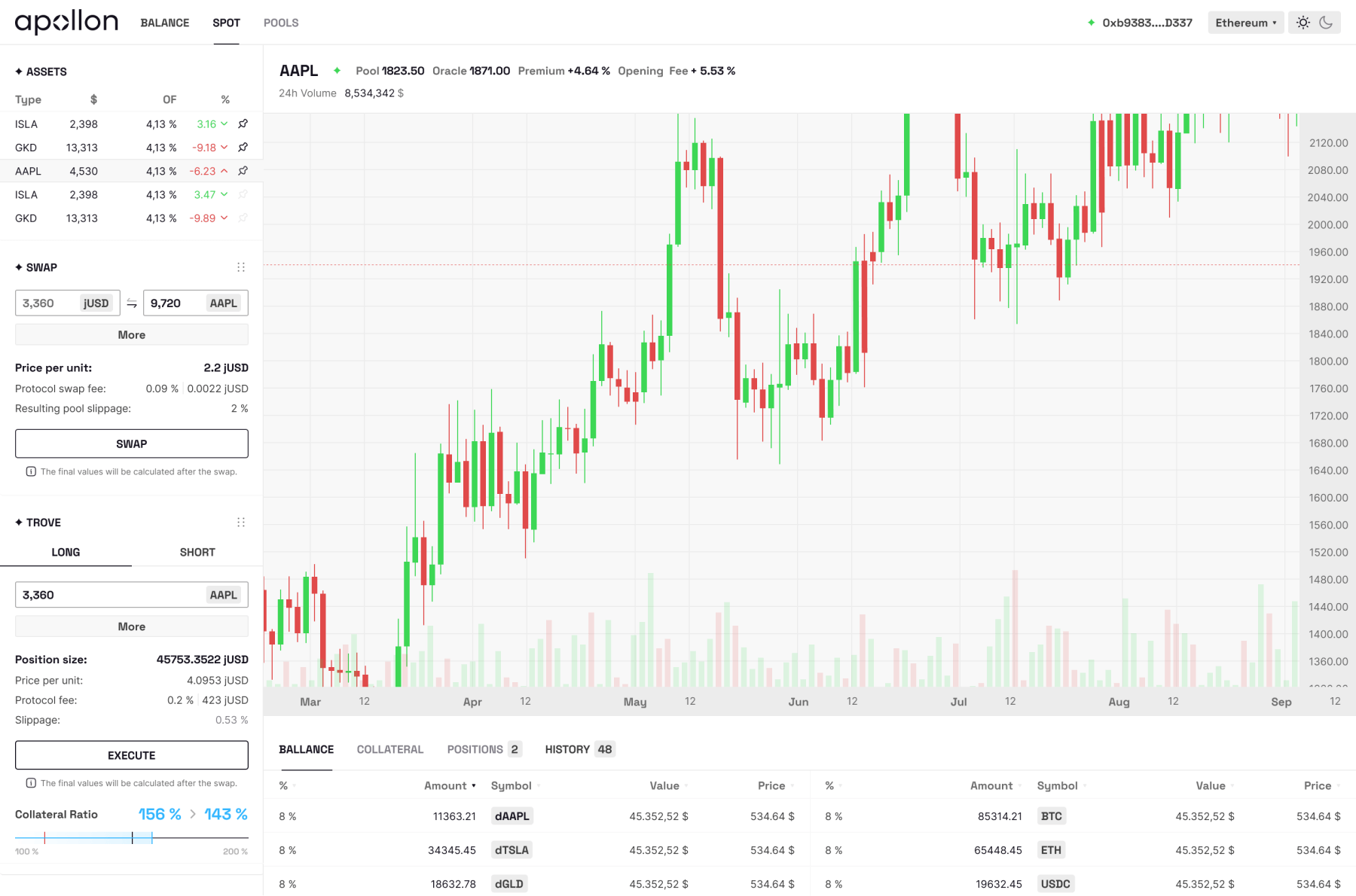
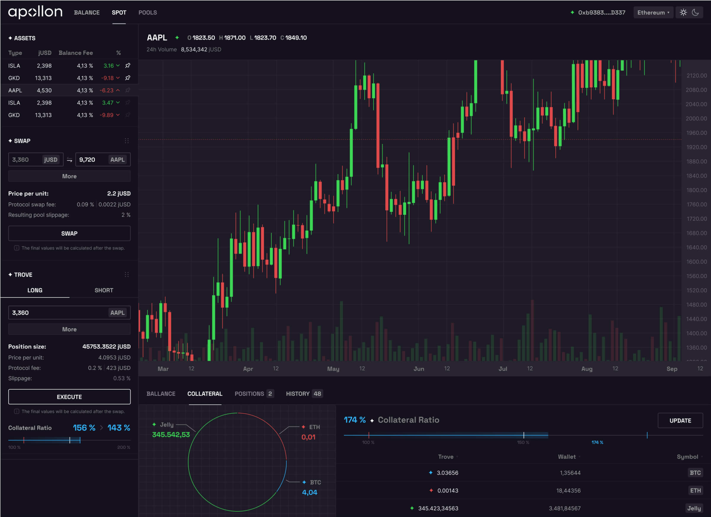
Built a tokenized design system supporting both dark and light modes, with modular components designed for fast scaling. Created an intuitive layout with clear navigation that reduces friction at every step. The system is small, but every piece has a job.
Web + Webflow
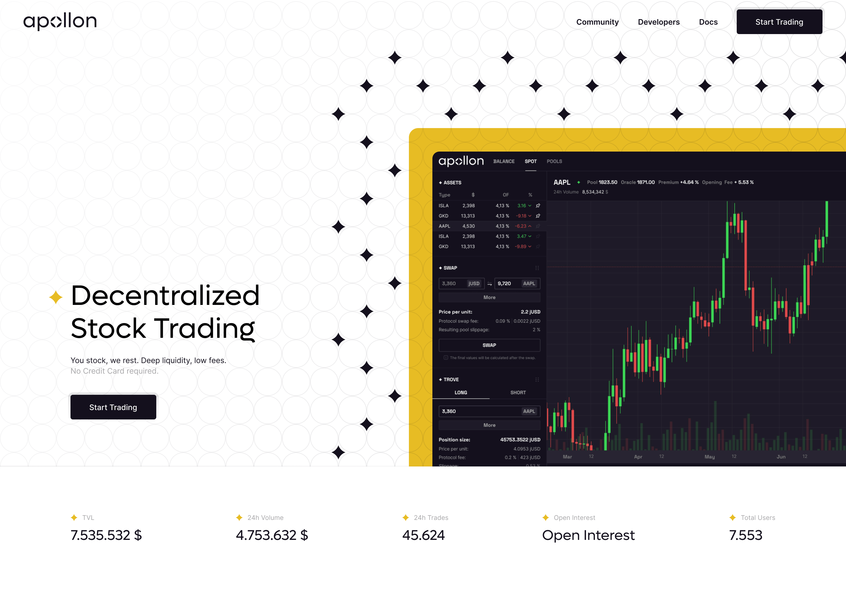
Integrated the new identity into the Webflow site from typography to color accents. Delivered a structure that's lightweight, fast, and easy to maintain so the team can iterate without breaking things.
Results
6 wks
Hit every deadline, stayed on track
Optimized
Tokenized system, faster updates
Consistent
Unified brand across all channels
What I would do differently
If I started today, I'd push for a structured user research round before the app phase. The product team had clear intuition about what users needed, and the result holds up, but a few short interview sessions would have validated the navigation choices earlier and probably trimmed one design revision. Worth the extra week.
Deliverables
- Brand identity
- Logo
- Visual style
- App UX
- App UI
- Design system
- Dark + Light mode
- Webflow Build
- Figma
Questions about the project
What is Apollon.fi?
Apollon.fi is a crypto wallet built for traders who want to move assets easily without relying on third parties. It focuses on speed, clarity, and self-custody.
What did the project include?
Full brand identity (logo, palette, visual style), app UX and UI with a tokenized design system supporting dark and light modes, and a Webflow site that mirrors the new brand. End to end.
How long did the Apollon redesign take?
Around 6 weeks from kickoff to launch. Every milestone hit on time, including branding, app design, and Webflow build phases.
What does the Apollon logo represent?
A typographic logo with the letter "O" treated as a spark of light. It symbolises guidance and trustworthiness, paired with circular elements that bring stability.
Why did the brand use a purple-blue palette?
Deep purple-blue communicates trust, intelligence, and authority. Combined with black and white, it gives the wallet a serious, premium feel without leaning into the typical crypto cliches.
Can I get a similar project for my product?
Yes. I work with SaaS, fintech, and crypto teams on branding, app UX/UI, and Webflow builds. Drop me a message and I'll tell you if it's a fit.
Interested in Working Together?
Let’s talk about your next project! Whether you need help with user-centered design, scalable solutions, or a full UI/UX overhaul, I’m here to bring your ideas to life. Let’s create something impactful together.